

With sales of iPads, tablets, and smartphones on the rise, web traffic from mobile devices is rising as well. Is your website ready?
What’s somewhat ironic about this post is that my theme is not responsive. However it does show up well on a smartphone or tablet and contains no flash. So if you’re reading this on a phone, you might have had to zoom in, but the experience isn’t too cumbersome.
Anyway, back to the point of the post.
I have my hands on around a dozen websites at some point every week. This morning, I ran a report on two of them to see what their mobile vs. desktop traffic was. Here are the results.
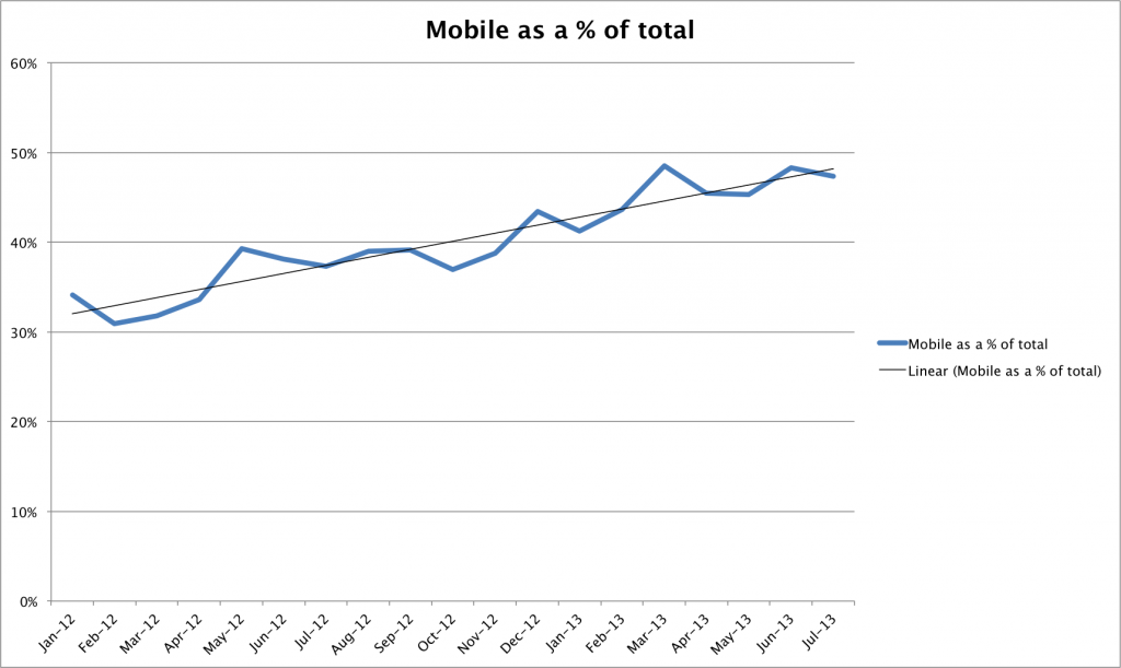
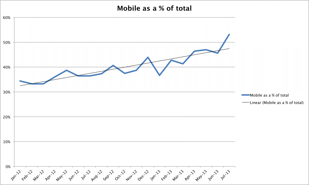
As you can see, while these two sites have different audiences and cover different topics, they are experiencing almost identical growth in mobile traffic. In fact, over the past 18 months, they’ve each seen a 50% increase in mobile traffic—from 32% of the total to 48% of the total. Much of this increase could also be attributed to social media. If the bulk of your traffic comes from social sites, your mobile traffic will likely be higher than other sites.
So what should our response be to this trend?
- Don’t use non mobile-friendly elements on your site – Flash, pop-ups, etc., should not be used unless it is absolutely necessary.
- Use a mobile friendly platform – WordPress themes that are responsive are critical if you are a blogger. I’ll be migrating mine to a new theme later this summer.
- Learn to write for the Web – Long paragraphs are difficult to read on small screens. Write short, pithy paragraphs instead of long, rambling ones.
- Know your analytics – Study where your traffic is coming from and what type of traffic it is. If you don’t have Google analytics on your site, what are you waiting for?
Felt so hopeless looking for answers to my qutteions…unsil now.